We recently upgraded mock-set-plus to improve mobile user experience.
- Improvements to product gallery for making titles and descriptions more legible,
- Re-positioning some of the controls in test session and review screens to have larger share of screen space for the Q/A content.
Following are the screens that were redesigned for improving mobile accessibility.
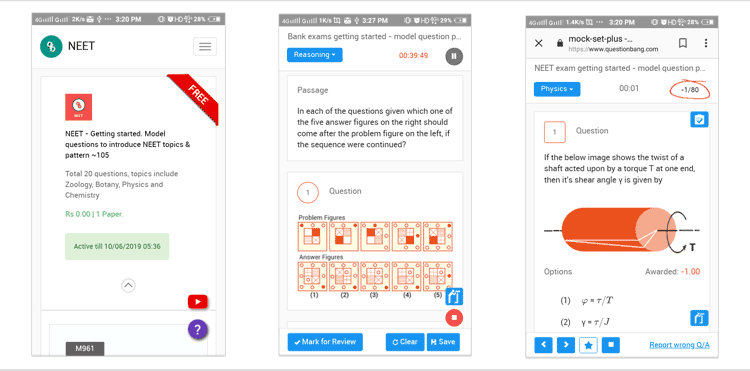
My Tests
This screen is same as desktop version. The difference is – the product title, description and some of the tags have been laid out vertically.

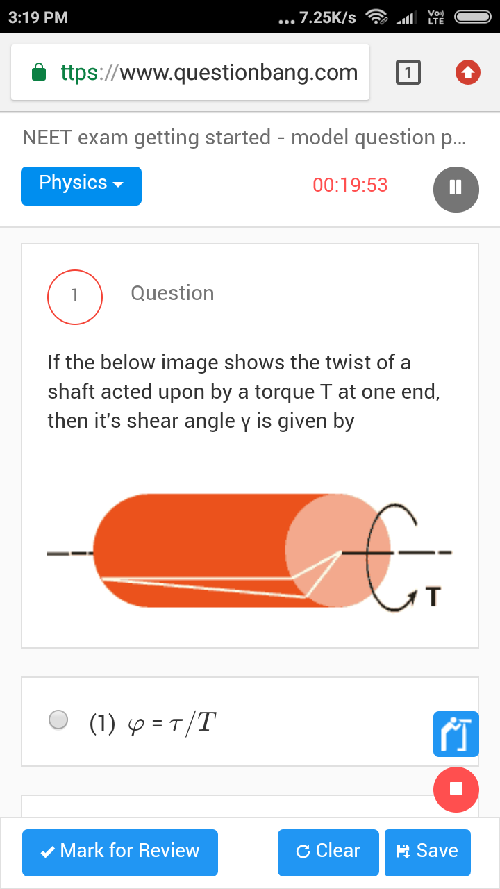
Test Session
This screen is slightly different from the desktop version. The screen has an additional control (overview button) to monitor session progress. The overview button will bring up a dialog showing number of questions completed, pending & marked for review in the ongoing session.
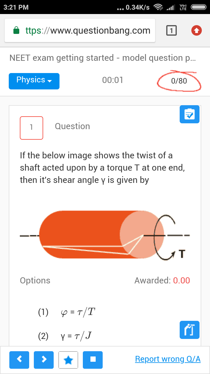
Test Review
The screen has two additional controls in comparison to the desktop version. viz.,
|
|
|
We value your feedback and welcome any comments to help us serve you better.